Creating & Editing Video, Audio & Animation

I’d suggest: Expert’s analysis reveals details hidden in plain sight

I think philosophy is relatively low status, whereas expert is high status. It’d probably be socially OK after the analysis to mention that you’re an expert in philosophy. Anyone who reads that far is more likely to have accepted that you do know what you’re talking about and be less off-put by the label philosophy.

What about this?

Philosopher reveals surprising complexity in a regular paragraph

1 Like

Text has more detail than you realize

I don’t know how to do all of that. I think some of it is just done with more work than seems reasonable to my intuitions (some magic tricks work that way too).

This stuff I understand OK.

On a related note, Apple released Magic Move in 2009 and it took Microsoft 7 years to copy it for Powerpoint (as Morph).

After moving multiple posts to this thread, they ended up in the order I moved them, not chronological order. I think I’d prefer chronological.

They’re chronological within a group that are moved at the same time (which requires they be moved from a single other topic).

EDIT: After posting this I see a “1 MONTH LATER” note above it, indicating there was a big time gap since the previous post. But there wasn’t. This topic is actually two days old.

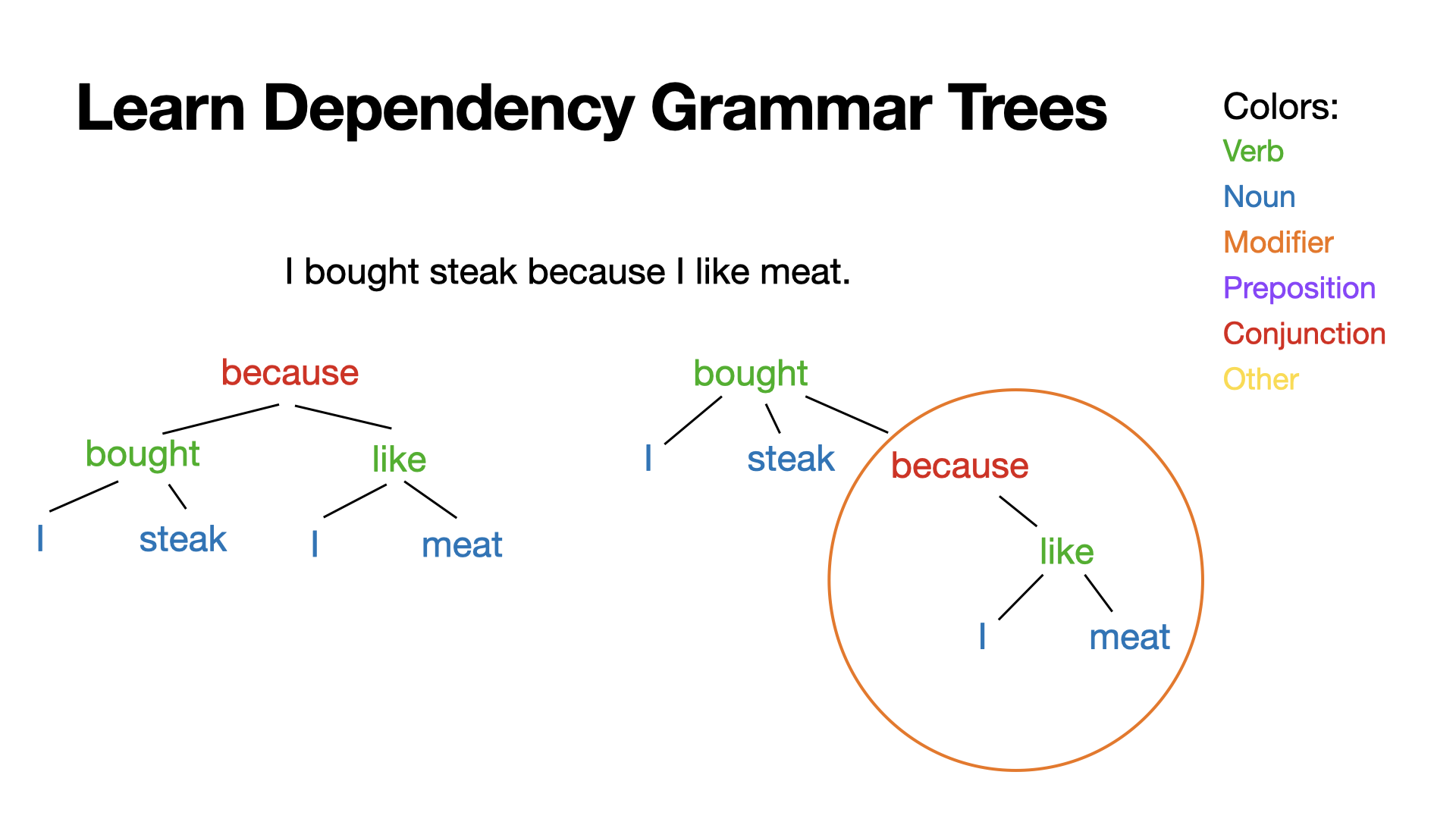
I have a new video on the CF channel coming soon. My draft title is “Learn Dependency Grammar Trees”. Here’s the thumbnail:

Is that a good title and thumbnail? Any suggestions to improve it so more people will watch (who would actually be interested)? What would work better on you?

Most of the video content looks similar to the thumbnail.

I made animation demos:

grammar tree animation test

circle animation test

The circle was meant to fill up without gaps, but it’s good enough for a proof of concept, and this way it’s actually much easier to see how I made it (8 rotating arcs rotating different numbers of degrees for different durations). Rotation goes around the midpoint so to make the arcs rotate around the circle I had to group them with a transparent circle and rotate that group. Keynote crashed 3-4 times while I was making this. Once I started saving every few steps it didn’t crash again lol.

Yeah. Reading from the top, I got a bit confused b/c there was new posts, then your post w/ powerpoint videos which I’d already seen before. Chronological would be better.

Which thumbnail is better?

Context:

Title: How to Practice Abstract Concepts like Error Correction | Learn Philosophy

Description: Philosopher Elliot Temple demonstrates thinking in terms of error correction. Practice this to become a better thinker.


Suggestions?

I like the purple one better. Not entirely sure why. I think it’s because it stands out more to me.

thx. do you like tilted or straight images better?

Np. I like the tilted pictures better.

Video making software tools I use frequently:

  • Keynote
  • Final Cut
  • Motion
  • Compressor
  • Recut
  • Handbrake
  • OBS
  • Affinity Designer
  • DemoPro

Other tools include: Loopback, Sound Source, Audio Hijack, Descript, Quicktime, ffmpeg, Fission, Pixelmator Pro, Screenflow, MindNode, VLC, IINA, AirSever.

Others may find these tools useful or have suggestions. My list is very Mac oriented.

I also use OBS + virtualcam + a streamdeck for some work presentation type stuff. The streamdeck can be replaced by macro keys or even some OBS plugins like auto scene switcher.

The reason I use virtualcam and not screen-sharing (besides all the things that OBS can do) is that I’ve found that video conferencing apps will rarely share screens with a high framerate – often it’s like 5 fps or something horrible – but they’ll share webcams at 30fps, even if it’s showing finer details as with screensharing.

The thumbnail idea seems okay but the images aren’t great IMO, and I don’t think they’ll work v well when they’re small.

This is about the size that YT thumbnails on the homepage appear on my monitor:

image

I can’t really tell what the bottom left and 2 upper right images are anymore. The helicopter one is okay still (something about a chopper and a pool sounds relevant to error correction), but the others are wasted IMO.

I couldn’t even really tell what the car-lift one was until I viewed the image in a new tab. (I can see it now easy enough, tho)

Is the top-right one like mahjong with wires?

I prefer the blue bg over purple, but IDK if that matters for thumbnails.

I think I have abnormal YT intuitions. Here are the two main ways I find videos:

I use the notifications menu the most. Notifications there are tiny and I don’t even try to see what most of the things are. A lot of the words are unreadable too. I don’t really pay attention to thumbnails. I mostly look at title, and I usually recognize the channel icon since this is only channels I subscribe to.

RSS doesn’t even show thumbnails. I go by author and title.

I do sometimes look at recommended sidebar videos while watching a video or do a search (I think those are similar activities – the sidebar is like an automatic search for the keywords of whatever video you’re watching). I rarely use end cards. A lot of times I use these features to find the next video in a series or more similar videos from a creator who I just found – and if the features don’t do what I want I just go to their channel page and look through their videos there (I usually do that anyway when I find someone new that I like). I mostly go by title and author. I keep autoplay disabled.

I use YT almost exclusively on Mac. I actually tried going on the YT phone app the other day while making thumbnails just to see what it looked like. I scrolled a bit and it kept showing me stuff I’m subscribed to with the bell purposely not rung because I don’t want it in my notification menu. The result was I got a spoiler for who won a chess tournament. Almost all my chess feeds have the bell disabled – I use RSS for them – because they post way too many spoilers… I did notice the phone had larger thumbnails than computer, not smaller… I don’t know why they make the bell menu so tiny and awful but it still seems like the best way to find things (besides RSS). There should be a notifications page with larger thumbnails but I’m pretty sure that just doesn’t exist. Instead there is a subscriptions page that includes the channels where I have notifications disabled, but I don’t really want to unsubscribe and have no way to remember they exist (other than RSS). I find it really useful to be able to split my subscriptions into two categories: the ones I want notifications for and the ones I don’t. I think YT is hostile to that on purpose.

Anyway I reduced the thumbnail to three pics and changed two of them so it’s easier to see what stuff is. A ton of (popular!) videos have thumbnail elements that are too small at the sizes that I commonly see thumbnails at. Are they all just screwing up badly and you’re actually supposed to make thumbnails work well when tiny? Or do people maybe just glance at thumbnails for a vague overall impression? If a lot of people aren’t trying to see thumbnail details, the ones with a lot of text are still clearly screwing up. For text-heavy thumbnails, maybe computer users ignore but mobile users prefer reading text in the thumbnail over the title?

Do you have examples? I did a quick scan of my front page and ‘new to you’ ~category and didn’t see anything that is particularly hard to see. Here’s the latter as a sample (note: I’m zoomed out to 80% here to get a nice grid, but my UI is at 125% on this machine, so it probably evens out)

There are some elements that are too small to make out in some thumbnails, but those bits don’t seem important to the thumbnail (like the text in terminal in the linux filesystem vid).

I checked the front page in an incognito tab too and didn’t see any that I thought qualified.

Which do you like better?

or

Other feedback also welcome (including on any thumbnails I publish, btw).

This is feedback I think you won’t implement because it’s kind of lying. A thumbnail will less complexity gets more click I think so a even better thumbnail than these two would be simple tree with few nodes very in the center of the photo and very in focus. It’s kind of lying because you’re give an impression of an easy thing on the thumbnail but the content of the video is more complex.


This for example makes thing look very simple. Doesn’t portray the complexity of the content of the video.

by this I mean the making things in the thumbnail pop