Topic to talk about making videos and podcasts, including editing.
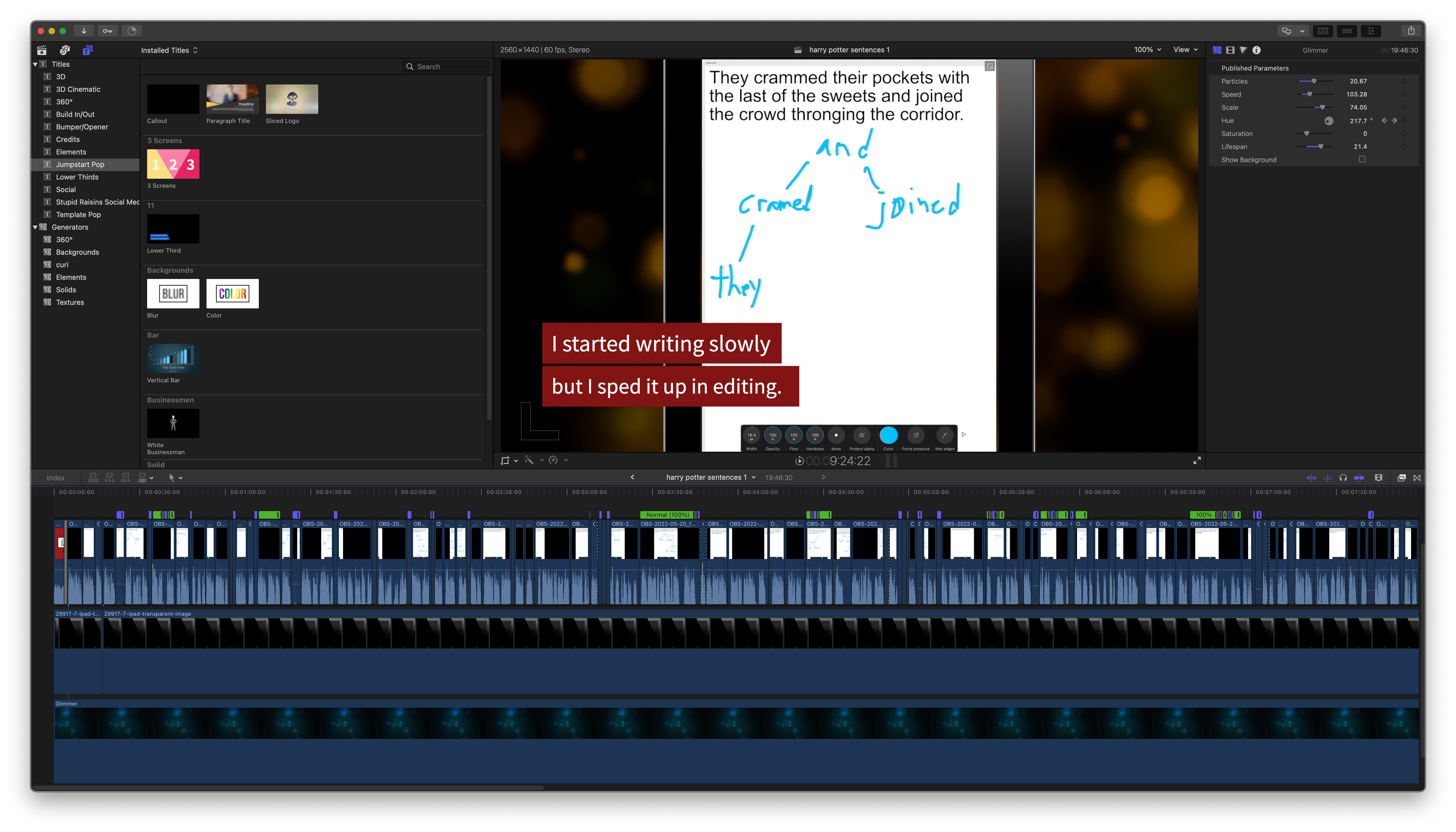
The video I’ve been making today – grammar practice with Harry Potter sentences and Apple Pencil – has a more complicated timeline than usual.
Does anyone have experience using software to improve audio/voice? Like:
(Facebook bought and discontinued that one.)
I don’t know if I should get/use anything. I know some of this stuff is built into final cut already (FCP is showing 109 audio effects installed including a de-esser and a “voice over enhancement” effect) but i haven’t used their stuff (though i think i’ve used a few of the same things via audio hijack or OBS, e.g. a noise gate or a background noise remover).
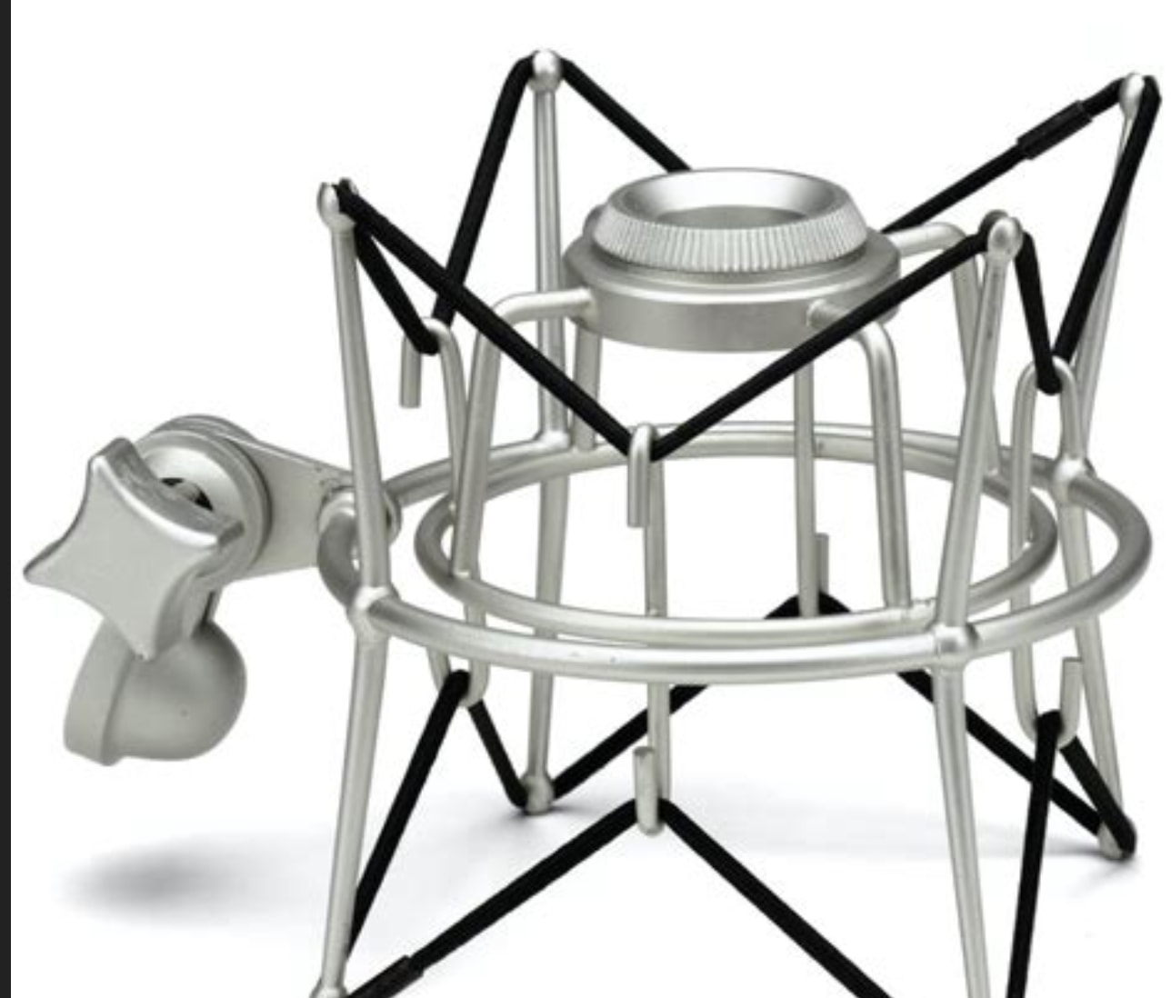
related: i tried to research mics in the past and found it difficult to figure out what’s actually good. i have an audio technica AT2020 USB mic with a small stand, pop filter, and a shock mount that looks similar to:
on a related note this looked potentially good:
but first they need to update it for apple silicon and the latest FCP version (both of which I’m using). i was looking for an audio visualizer first when i saw an era demo video. i know i can also do an audio visualizer with: ffmpeg, motion (it’s a bit of a hassle though), descript or some audiogram websites

I’d think it’s good to know how the youtube algorithim works even if your just a viewer, so that you have some understanding of how videos are being reccomended to you.
I agree. On a related note, Elon Musk (who is in the process of buying Twitter) said he wants to make Twitter’s algorithm transparent by uploading the actual code to GitHub and enabling suggestions (and criticism) from the public. I hope that happens (and that other social media companies are then pressured into doing it too). He also recently tweeted telling Twitter users how to use the sparkle menu to change from Home to Latest mode so that Twitter behaves more like a chronological timeline of tweets (like it originally did). What you see in Home mode is determined more by the algorithm. He suggested comparing the two modes to see the differences for yourself.
I agree with him and consider Home mode awful. Worse, it changes back to Home mode by itself sometimes, so you have to keep changing to Latest. Also, reading Twitter via a list instead of your regular feed actually works even better for disabling the social algorithm stuff, although it also breaks some positive features – tweet threads are displayed worse. Overall, Twitter is pretty awful and IMO should be mostly avoided.
I made a feature request to Affinity Designer, Vectornator and Motion:
Feature Request: Connection Line Tool
Please add a connection tool like in Keynote, Pages, Numbers, draw.io and various flowchart apps. It creates a connecting line between two objects. If one object is moved, that end of the connection moves too. In other words, you can anchor the end of a line to an object.
To try it in Keynote, select two objects (e.g. shapes or text boxes) then customize toolbar and add the Connect button, or use the menu: Insert → Line → Straight Connection Line (I added a hotkey for it in System Preferences). You can move either object and the connection line adjusts, you can style the connection line, and you can also drag the end of a connection line to attach to another object or unattach it and put it at a fixed position.
Philosopher’s analysis reveals details hidden in plain sight
how do i reword that title to be socially calibrated?
i wanted something about how there’s more detail in text than ppl realize
There’s more detail in text than you realize | Philosopher’s analysis
is that better or worse?
i thought of versions like
Text has surprising detail | Philosopher’s analysis
but that has 2 problems
- they’ll read it as there is a surprising detail within the text
- they won’t read “text” right. it could be text in general
This paragraph has a surprising amount of detail (like all paragraphs) | Philosopher’s analysis
that’s more accurate but less snappy…
Philosopher shows a regular paragraph has a surprising amount of detail that can be analyzed
that’s long-winded.
Suggestions?
I’d suggest: Expert’s analysis reveals details hidden in plain sight
I think philosophy is relatively low status, whereas expert is high status. It’d probably be socially OK after the analysis to mention that you’re an expert in philosophy. Anyone who reads that far is more likely to have accepted that you do know what you’re talking about and be less off-put by the label philosophy.
What about this?
Philosopher reveals surprising complexity in a regular paragraph
1 Like
Text has more detail than you realize

I don’t know how to do all of that. I think some of it is just done with more work than seems reasonable to my intuitions (some magic tricks work that way too).

This stuff I understand OK.
On a related note, Apple released Magic Move in 2009 and it took Microsoft 7 years to copy it for Powerpoint (as Morph).
After moving multiple posts to this thread, they ended up in the order I moved them, not chronological order. I think I’d prefer chronological.
They’re chronological within a group that are moved at the same time (which requires they be moved from a single other topic).
EDIT: After posting this I see a “1 MONTH LATER” note above it, indicating there was a big time gap since the previous post. But there wasn’t. This topic is actually two days old.
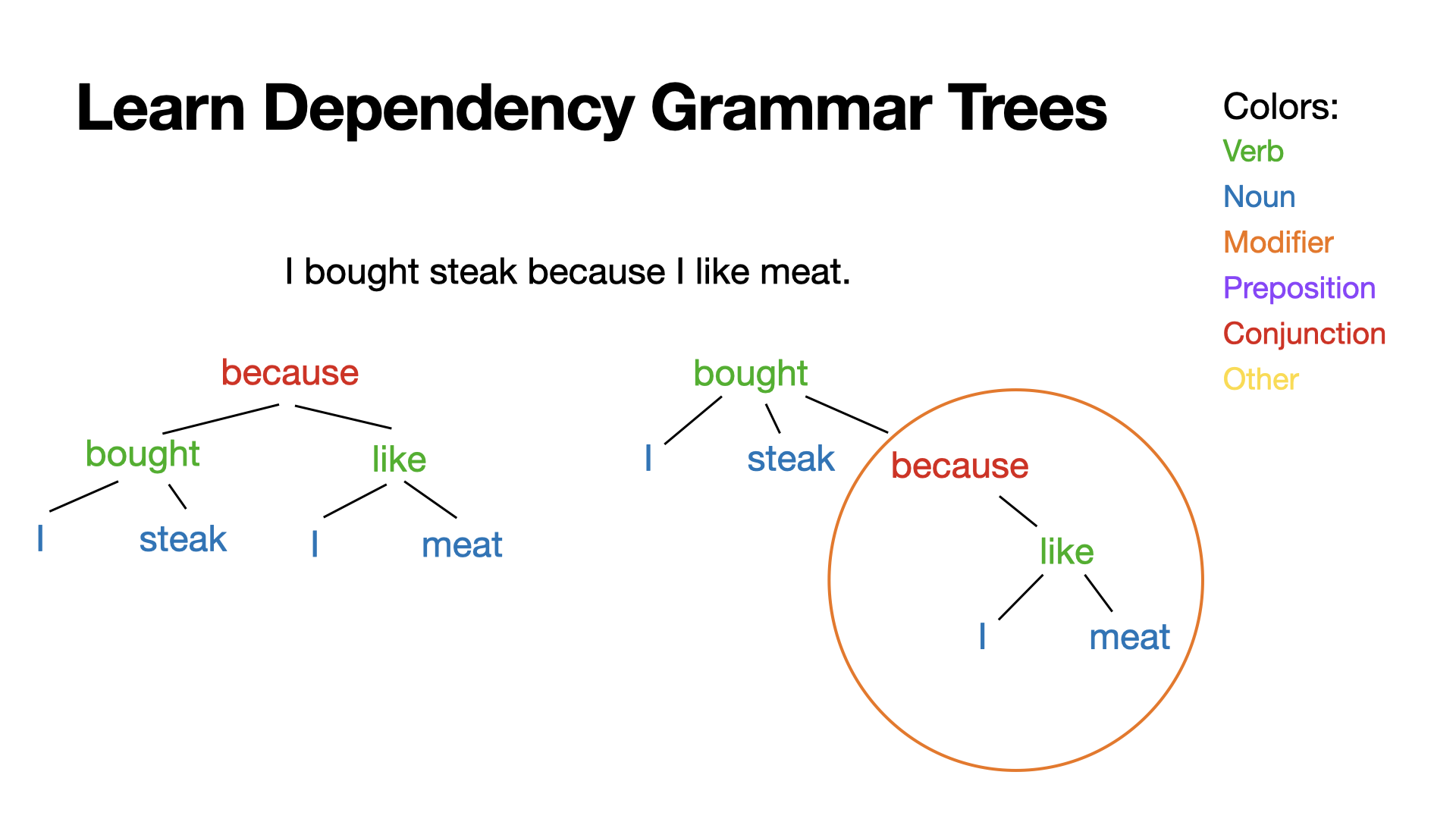
I have a new video on the CF channel coming soon. My draft title is “Learn Dependency Grammar Trees”. Here’s the thumbnail:
Is that a good title and thumbnail? Any suggestions to improve it so more people will watch (who would actually be interested)? What would work better on you?
Most of the video content looks similar to the thumbnail.
I made animation demos:

The circle was meant to fill up without gaps, but it’s good enough for a proof of concept, and this way it’s actually much easier to see how I made it (8 rotating arcs rotating different numbers of degrees for different durations). Rotation goes around the midpoint so to make the arcs rotate around the circle I had to group them with a transparent circle and rotate that group. Keynote crashed 3-4 times while I was making this. Once I started saving every few steps it didn’t crash again lol.
Yeah. Reading from the top, I got a bit confused b/c there was new posts, then your post w/ powerpoint videos which I’d already seen before. Chronological would be better.
Which thumbnail is better?
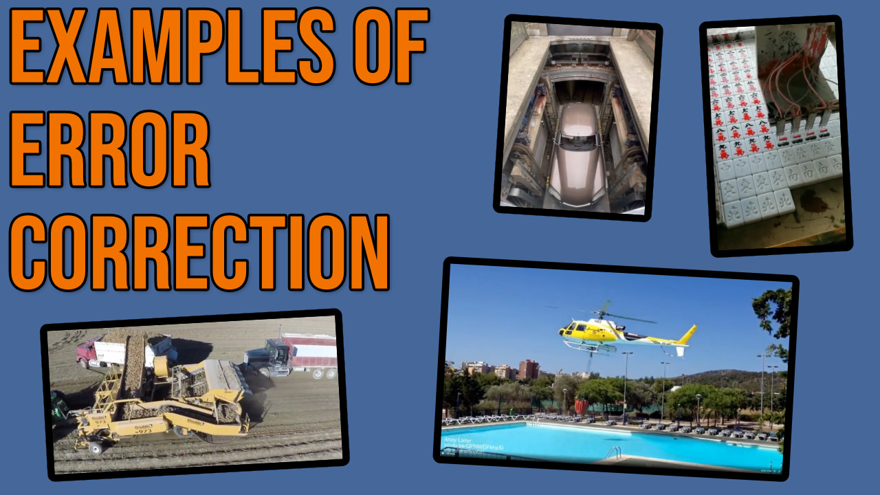
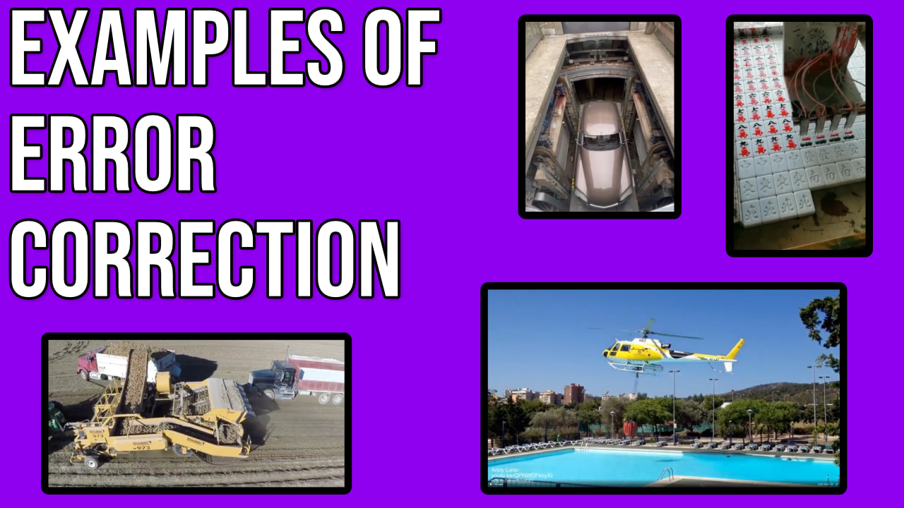
Context:
Title: How to Practice Abstract Concepts like Error Correction | Learn Philosophy
Description: Philosopher Elliot Temple demonstrates thinking in terms of error correction. Practice this to become a better thinker.
Suggestions?
I like the purple one better. Not entirely sure why. I think it’s because it stands out more to me.