thx. do you like tilted or straight images better?
Np. I like the tilted pictures better.
Video making software tools I use frequently:
- Keynote
- Final Cut
- Motion
- Compressor
- Recut
- Handbrake
- OBS
- Affinity Designer
- DemoPro
Other tools include: Loopback, Sound Source, Audio Hijack, Descript, Quicktime, ffmpeg, Fission, Pixelmator Pro, Screenflow, MindNode, VLC, IINA, AirSever.
Others may find these tools useful or have suggestions. My list is very Mac oriented.
I also use OBS + virtualcam + a streamdeck for some work presentation type stuff. The streamdeck can be replaced by macro keys or even some OBS plugins like auto scene switcher.
The reason I use virtualcam and not screen-sharing (besides all the things that OBS can do) is that I’ve found that video conferencing apps will rarely share screens with a high framerate – often it’s like 5 fps or something horrible – but they’ll share webcams at 30fps, even if it’s showing finer details as with screensharing.
The thumbnail idea seems okay but the images aren’t great IMO, and I don’t think they’ll work v well when they’re small.
This is about the size that YT thumbnails on the homepage appear on my monitor:
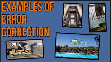
I can’t really tell what the bottom left and 2 upper right images are anymore. The helicopter one is okay still (something about a chopper and a pool sounds relevant to error correction), but the others are wasted IMO.
I couldn’t even really tell what the car-lift one was until I viewed the image in a new tab. (I can see it now easy enough, tho)
Is the top-right one like mahjong with wires?
I prefer the blue bg over purple, but IDK if that matters for thumbnails.
I think I have abnormal YT intuitions. Here are the two main ways I find videos:
I use the notifications menu the most. Notifications there are tiny and I don’t even try to see what most of the things are. A lot of the words are unreadable too. I don’t really pay attention to thumbnails. I mostly look at title, and I usually recognize the channel icon since this is only channels I subscribe to.
RSS doesn’t even show thumbnails. I go by author and title.
I do sometimes look at recommended sidebar videos while watching a video or do a search (I think those are similar activities – the sidebar is like an automatic search for the keywords of whatever video you’re watching). I rarely use end cards. A lot of times I use these features to find the next video in a series or more similar videos from a creator who I just found – and if the features don’t do what I want I just go to their channel page and look through their videos there (I usually do that anyway when I find someone new that I like). I mostly go by title and author. I keep autoplay disabled.
I use YT almost exclusively on Mac. I actually tried going on the YT phone app the other day while making thumbnails just to see what it looked like. I scrolled a bit and it kept showing me stuff I’m subscribed to with the bell purposely not rung because I don’t want it in my notification menu. The result was I got a spoiler for who won a chess tournament. Almost all my chess feeds have the bell disabled – I use RSS for them – because they post way too many spoilers… I did notice the phone had larger thumbnails than computer, not smaller… I don’t know why they make the bell menu so tiny and awful but it still seems like the best way to find things (besides RSS). There should be a notifications page with larger thumbnails but I’m pretty sure that just doesn’t exist. Instead there is a subscriptions page that includes the channels where I have notifications disabled, but I don’t really want to unsubscribe and have no way to remember they exist (other than RSS). I find it really useful to be able to split my subscriptions into two categories: the ones I want notifications for and the ones I don’t. I think YT is hostile to that on purpose.
Anyway I reduced the thumbnail to three pics and changed two of them so it’s easier to see what stuff is. A ton of (popular!) videos have thumbnail elements that are too small at the sizes that I commonly see thumbnails at. Are they all just screwing up badly and you’re actually supposed to make thumbnails work well when tiny? Or do people maybe just glance at thumbnails for a vague overall impression? If a lot of people aren’t trying to see thumbnail details, the ones with a lot of text are still clearly screwing up. For text-heavy thumbnails, maybe computer users ignore but mobile users prefer reading text in the thumbnail over the title?
Do you have examples? I did a quick scan of my front page and ‘new to you’ ~category and didn’t see anything that is particularly hard to see. Here’s the latter as a sample (note: I’m zoomed out to 80% here to get a nice grid, but my UI is at 125% on this machine, so it probably evens out)
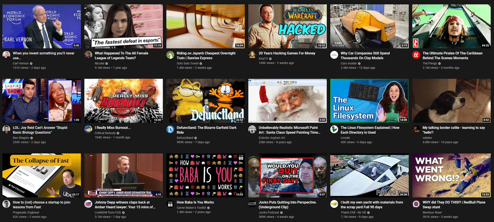
There are some elements that are too small to make out in some thumbnails, but those bits don’t seem important to the thumbnail (like the text in terminal in the linux filesystem vid).
I checked the front page in an incognito tab too and didn’t see any that I thought qualified.
Which do you like better?
or
Other feedback also welcome (including on any thumbnails I publish, btw).
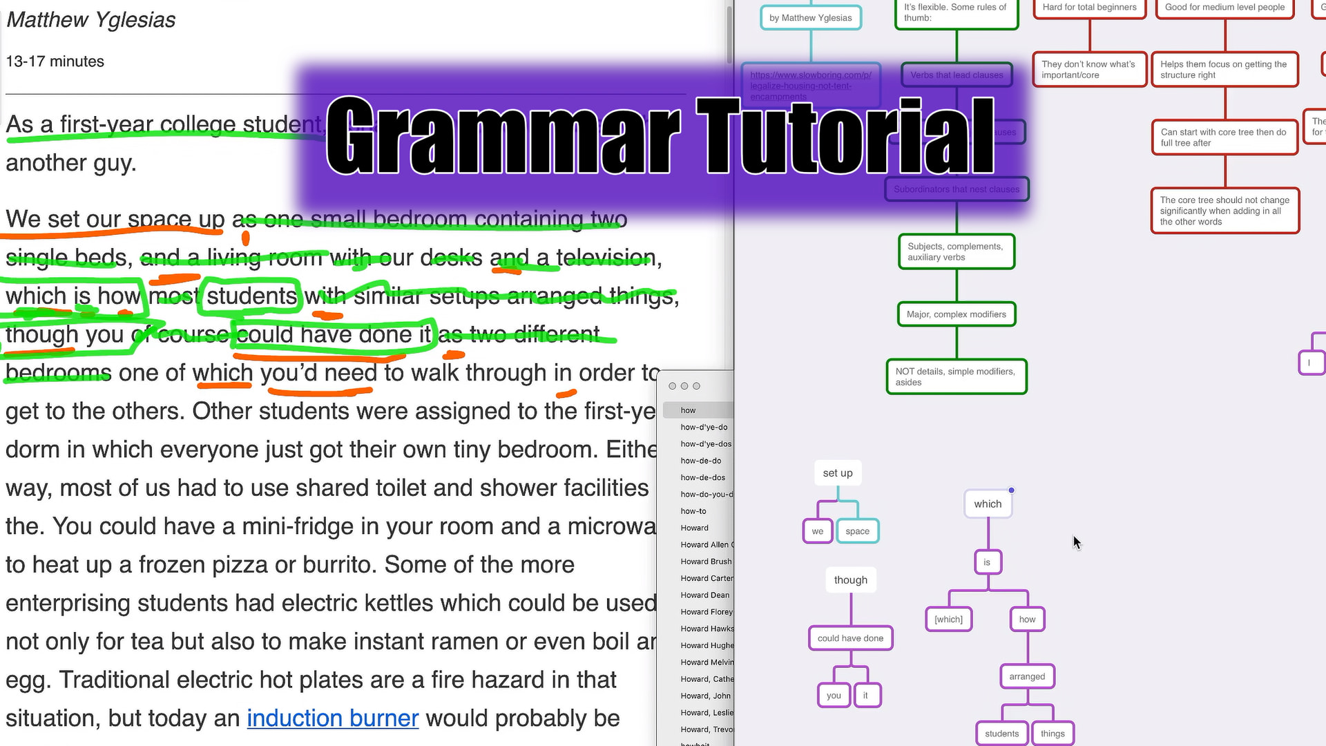
This is feedback I think you won’t implement because it’s kind of lying. A thumbnail will less complexity gets more click I think so a even better thumbnail than these two would be simple tree with few nodes very in the center of the photo and very in focus. It’s kind of lying because you’re give an impression of an easy thing on the thumbnail but the content of the video is more complex.

This for example makes thing look very simple. Doesn’t portray the complexity of the content of the video.
by this I mean the making things in the thumbnail pop
Actually I think this is wrong. I don’t think it’s kinda lying. Making things neat and tidy and removing unnecessary complexity, not having focus diverting thing is a good thing. It lets you better present the study material.
The feedbacks I have don’t make much sense to me right now so ignore. I think the feedback about neat and tidy is correct. The person doing the best job at explaining complex study material on youtube according to me is 3Blue1Brown. I’ve mentioned him before to you as well. His thumbnails are great. His presentation method is the great as well. If you criticise him for doing spoon feeding I and even he will mostly agree with you. He said in some video that most of the times people walk away from his video thinking they have got a good understanding of the ideas he explained but >90% of people leave with a poor understanding. But I don’t think that’s an argument to make the presentation quality worse. He makes it too easy for people to follow along. But I don’t think he should make his explanations less easy to understand and follow along to so that people are forced to think more.
so my feedback will be having a cleaner and tidier presentation space in your video and cleaner and tidier thumbnails. For example almost all the times the presentation space in his videos are a black screen and an object appears only when it is introduced/ talked about.
The wires diagram looks complicated to me. I don’t understand how you view it as simple. It has like 25+ things just for the +'s and -'s, 5+ red curves (looks like more due to the text and blue stuff breaking them up), 15+ blue circles, a battery, a lightbulb, and a wire with green dots. That’s like 50 design elements with several colors.
I think some of my recent thumbnails look simpler than the wires thumbnail. I could try a tree with fewer nodes or something else simpler, but that seems different than the wires thumbnail which has many design elements.
1 Like
I agree it is complicated. I don’t fully stand behind my feedback. The place from where my feedback came from might have some truth so I’ll try to explain why I said what I said but I think only some of it will make sense.
I think simple is not the right word to use to. Cleaner, neater, tidier are better words to point out what is it about that thumbnail that I preferred. I think simple intuitively came to my mind because it reminded me of simple circuit diagrams that we used to make it high school. But because it is a computer generated graphic it looks cleaner so it is easier to follow. The lines coming out are meant to portray fields which was again something we used to make diagrams of. But in this diagram again it looks better because things are tidier. This would’ve been your experience as well. Unless you’re good at drawing, your stuff starts looking messy. This is opposite of messy. Computers are used for making illustrative diagrams for this exact reason. They make things look less messy.
I dislike blurred text in pictures: I find it uncomfortable to look at.
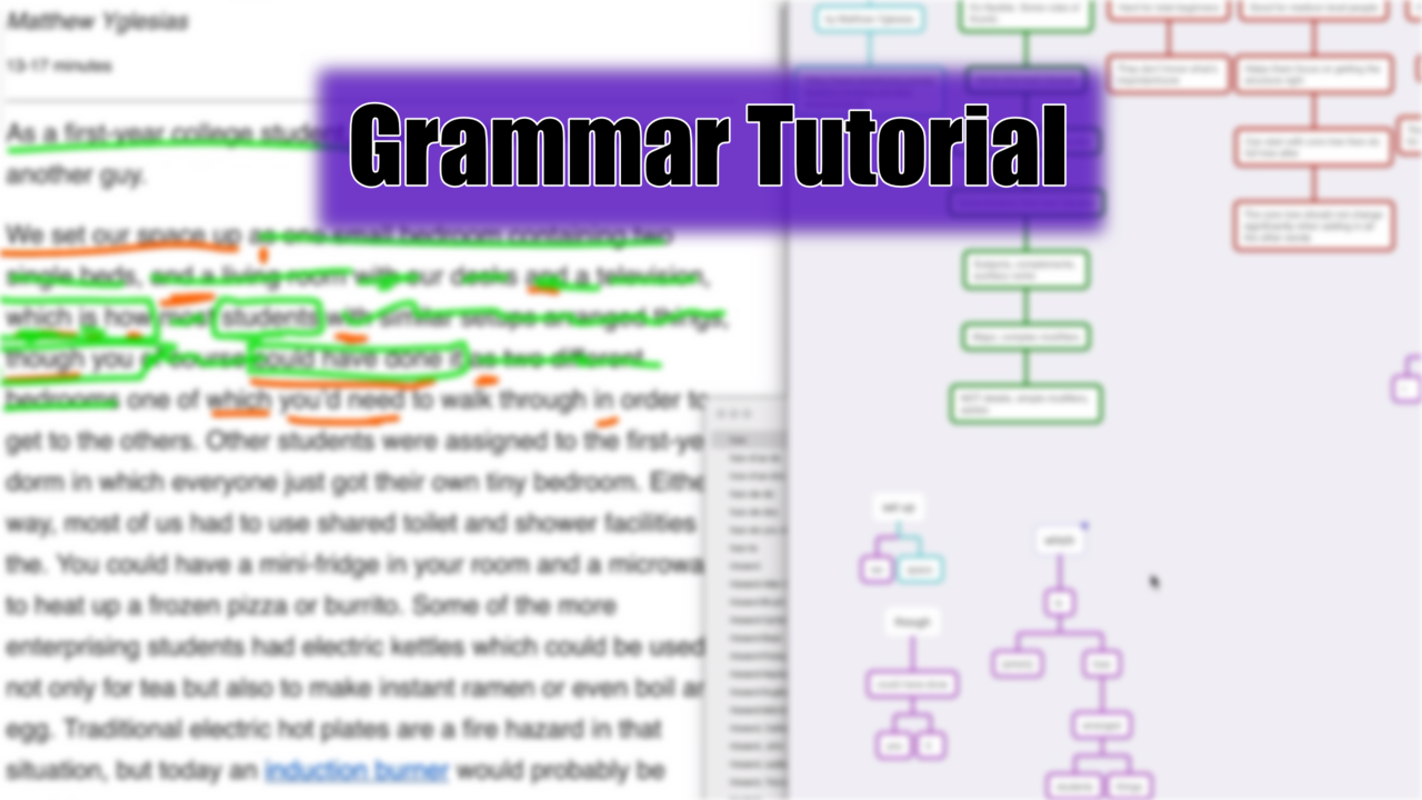
I like that grammar tree. I would like to make one but having it animated following a step by step outline of sentence patterns.